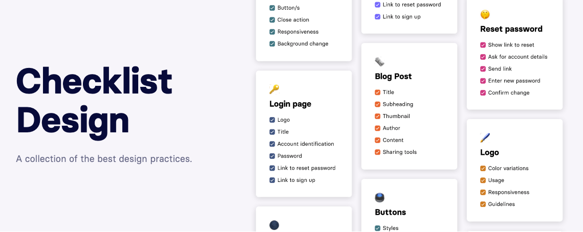
Mike Davidson shared on Twitter a link to a helpful resource for web and product designers called Checklist Design. An evolving and growing collection of best practices, Checklist Design is a site you'll want to bookmark and have on hand whenever you're working through your next design project and need to make sure you have the bases covered when knocking out tasks such as a pricing page, reset password flow or user avatar. In addition to handy lists to follow (some steps illustrated with example images) George went the next step and often includes links to accompanying articles, inspiration and online examples.
Checklist Design is made by George Hatzis, a designer and maker from Sydney, Australia who made it to help improve his workflow and reduce the number of pieces which can sometime fall through the cracks of the design process. After 20+ years of designing I still find corners of my design where I've missed steps or crucial components simply trying to remember everything from memory.
I love these kinds of resources and I'm excited to see this one grow in particular. This is a side project for George and you can help support his efforts by buying him a coffee.
Veteran Designer Benjamin De Cock took to Twitter this morning to share some technical insights into how he built increase.com. The site not only looks great but has some pleasing animations as well. Benjamin highlights a few of key aspects in his thread covering items such as the aspect-ratio CSS property for scaling and re-usability purposes, Web Animations API to more quickly iterate on the animation and effects, the benefits and versatility of clip-paths, and much more.
He illustrates each point with images making the thread an engaging and descriptive read. It's peeks-under-the-hood like this which continue to inspire and motivate me to branch out and explore new implementation solutions of web design.
I recently watched this tutorial video by Chris Coyier on CSS-Tricks hoping to pick up a few interesting tips on CSS Grid. Not only did I learn some useful tips related to Grid but I also picked up a couple handy workflow techniques while watching Chris at work. Here are my highlights:
At 4:30 Chris mentions (and I believe he credits Adam Argyle) how you can "Use CSS Grid just for the gap.” The gap feature is one of my favorite aspects of Grid…as you can quickly insert space between all of the elements in your container…and it never occurred to me to use it solely as a means of specifying “margins” for my markup. Very neat.
At 6:40 Chris shows off a tip for toggling a class on an element that I'm going to start using all the time now. Instead of writing a JS function or using something like jQuery, all you have to do is add a simple inline onclick event onto the HTML element on which you want to toggle a class on and off. This is the syntax: this.classList.toggle('className') Chris' use of this method is for adjusting the max-width of the <body> container simply by clicking on it and applying a separate class. He says he uses this approach sometimes when testing responsive layout changes because it eliminates the need of dragging the browser window in and out to see the changes take effect. Super helpful!
At 15:02 Chris shows a solution for a broken layout which occurred after changing the markup of the images and text to use <figure> tags instead. Wrapping the images and paragraph tags into <figure> tags caused the Grid logic to change the layout away from the intended result. To solve this, while still using <figure> tags, Chris adds a display: contents; declaration which I wasn't familiar with. That declaration essentially tells the browser to ignore the container and make the children elements act as the children of the next element up in the DOM. Once he adds that one line the Grid logic works again. There are some accessibility issues with this approach so while it seemingly works, it's one to use with care.
The whole video is worth watching just to see Chris solve the layout in real-time. He ends the video with an alternate solution to the broken layout using CSS Subgrid support, which currently only works in Firefox. Even though subgrid has yet to be more widely adopted by other browsers you can see the potential it has, especially in solving layout issues like the one in this video.