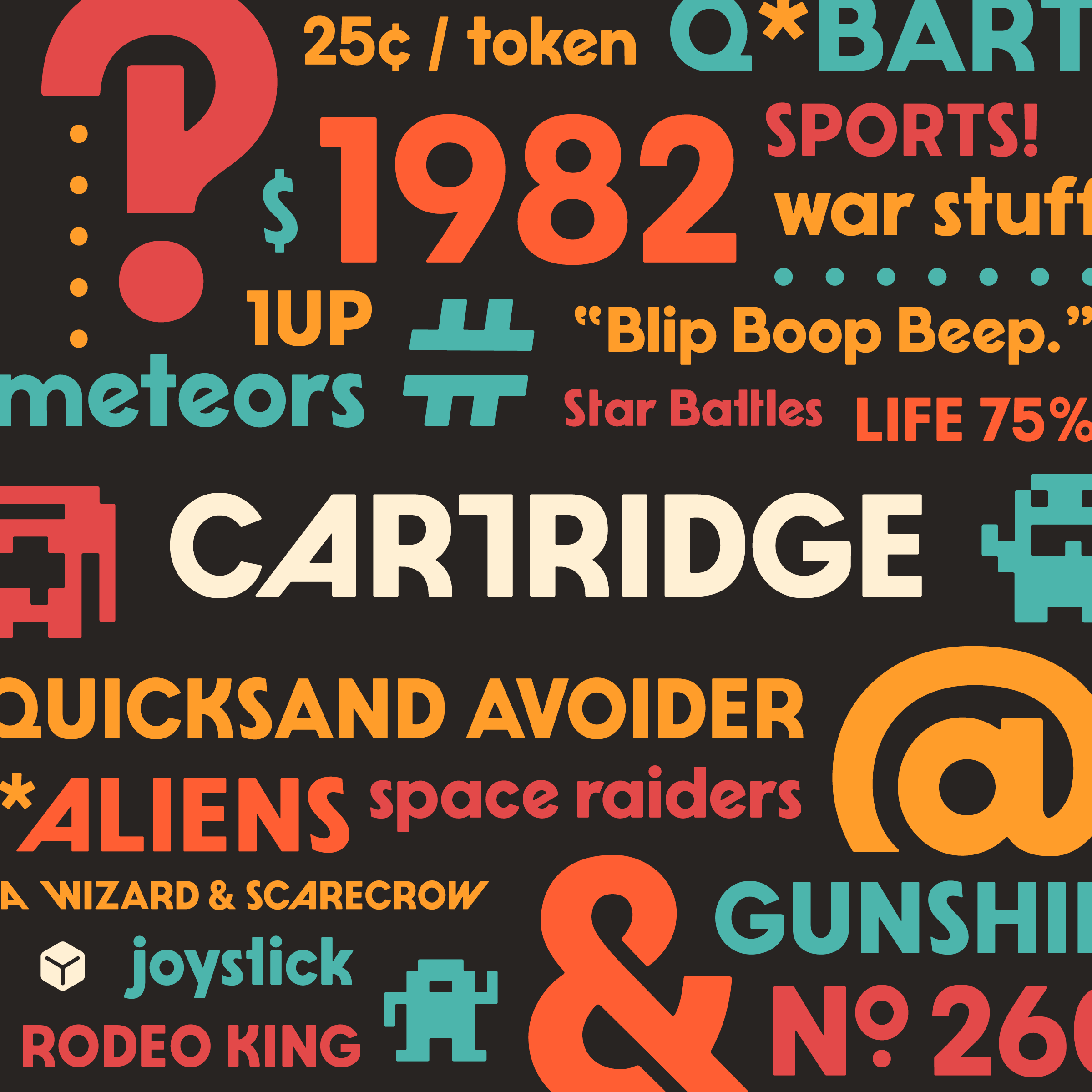
The inimitable Dan Cederholm is back again with another wonderfully delightful font named Cartridge. Inspired by the typography from classic Atari game cartridges, Dan crafted a new sans-serif full of quirk and character. There is a lot to love in Cartridge's glyphset. Some of my favorites are the numbersign, ampersand, set of alternates and hidden 8-bit monster glyphs. But while the characters look great in isolation, they truly shine when set together.
Dan has been steadily releasing typefaces and each are an example of his creative chops, but I'd say Cartridge demonstrates how his font-making skills have—pardon the pun—leveled up. Everything surrounding the release of Cartridge, from the marketing images, backstory and release video, show off just how much fun Dan is having making fonts. I'm looking forward to whichever font he has up his sleeve next.
Beasts of England (aka Simon Walker) is back again with another absolutely beautiful new typeface named Sisteron. The sweeping curves, embellished alternate caps, and elegant ligatures are masterful and firmly rooted in the delightful typographical elements I've come to expect from BOE's fonts. I love how well the glyphs lock together with their complimentary curves, it all feels very art nouveau. Grab a copy for $36.
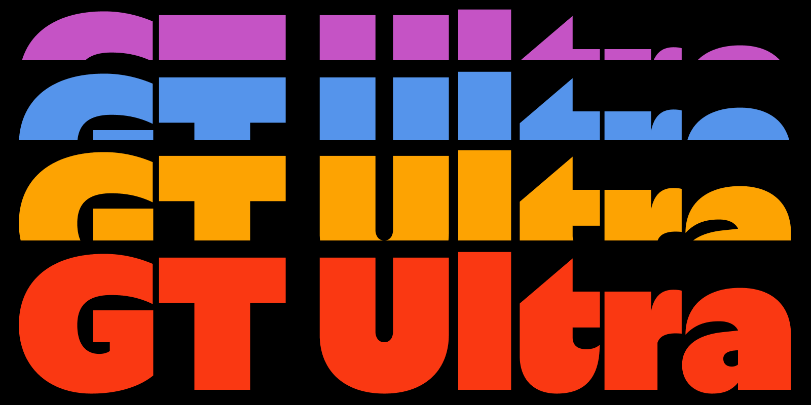
GT Ultra is the latest typeface from one of my favorite foundries, Grilli Type. GT Ultra sits somewhere between a serif and a sans-serif. It pulls on shapes and patterns of classic serifs and infuses them into a modern sans that is unique and something completely of it's own.
Grilli Type excels not only at typeface design but also in the presentation of their fonts. Their font minisites are informative and beautiful; the one for GT Ultra being no exception. Definitely explore it for a deep-dive into GT Ultra's construction, offerings and how it came to be.
In addition, Grilli Type's Instagram account is a must for all type fans and font creators. Their GT Academy was instrumental during my days building Rebar as they share a wealth of knowledge and font design wisdom. Check out this Guide they posted on Instagram as an example of what I'm talking about.
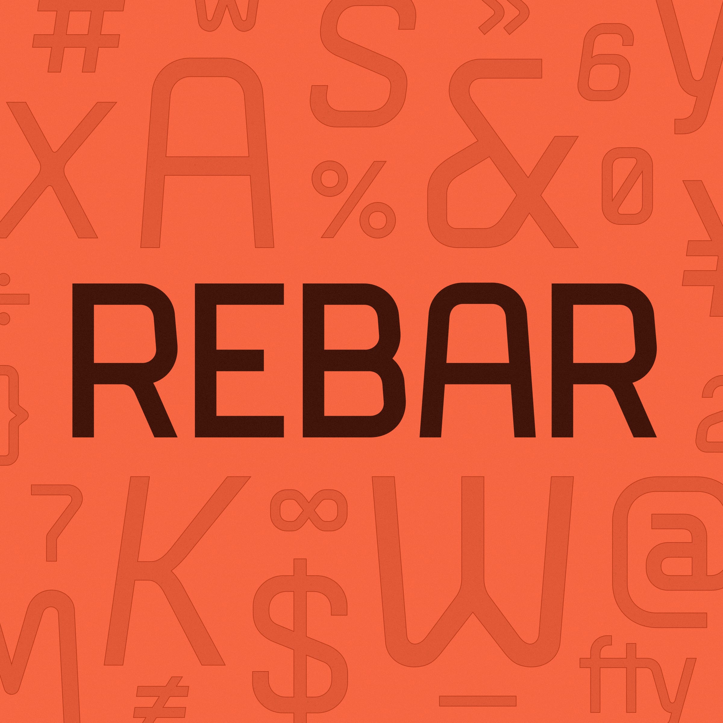
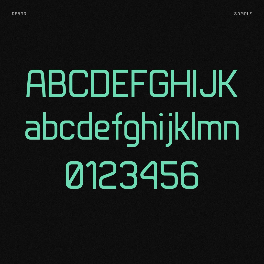
I recently finished my first font, Rebar, and made it available for purchase. I sort-of fell into creating Rebar by accident. I was working on a branding project for a friend, drew some letterforms that I liked and felt they could be evolved further into a full font. Little did I know how much I would enjoy the process.
I took the few characters I had and used Procreate on the iPad to quickly sketch out what the rest of the alphabet could look like. This helped me stay loose in the exploration phase, work out which portions would repeat and where I had the opportunity to introduce character and individuality on some letters. The next step was figuring out which font-making program I wanted to use to complete the font.
Another wonderful resource is Grilli Type's Instagram account where they regularly share their expertise via their GT Academy. The crew at Grilli Type also replied to a few of my early Rebar posts offering helpful feedback which helped me shape the final version. The big takeaway is the font-makers out there are willingly offering up their processes and wisdom. Seek them out and ask questions.
Initially I envisioned Rebar being a title case font only, but as I was finishing the uppercase figures I couldn't help but wonder what the lowercase figures could look like. Going through the mini-design challenge per figure to determine “What would the Rebar-version of __ look like?” was addicting. Before too long I had multiple weights, an italics style, support for other latin-based languages, fractions, some ligatures and more.
Spacing and kerning was a journey. I had basic spacing in place (mostly a default setting of 50 for each side-bearing) and prematurely begin creating kerning pairs. I learned through the process that I needed to spend more time dialing in my side-bearings on each figure and create spacing relationships between similarly-shaped letters. The Spacing article on the Glyphs website goes into all of the details, but the gist is you want your round letters to share similar spacing, straight-sided letters do the same, etc. You want to get as far as you can with only adjusting the spacing of your figures before starting any kerning. I learned that the hard way and had to undo a couple hours worth of kerning pairs. In the end I probably re-did my kerning 3 times because I didn't understand the power of Kerning Groups until the 2nd time through. Again, the Glyphs website goes into great detail on these subjects and you'll want to read every where of their Kerning article.
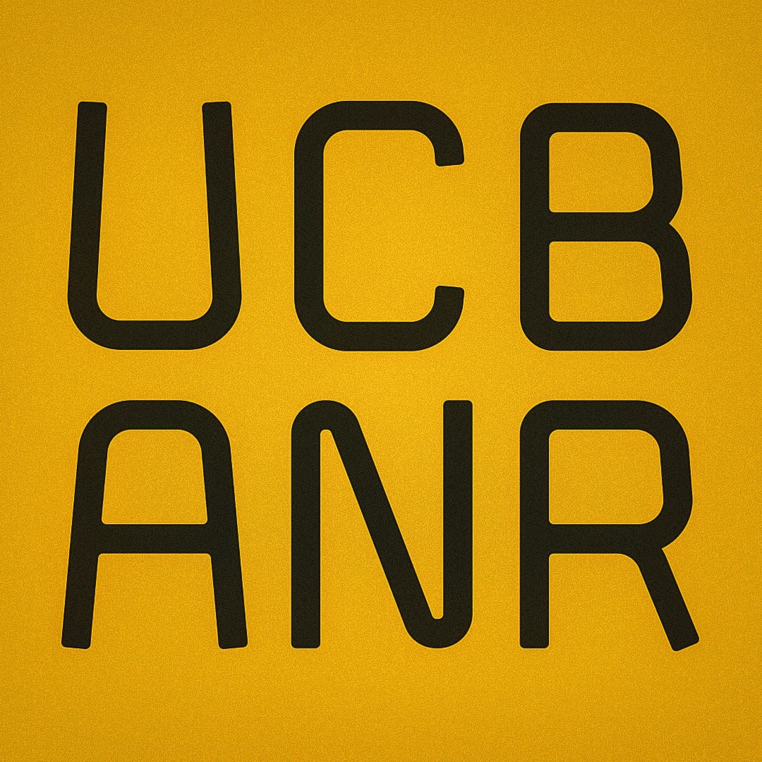
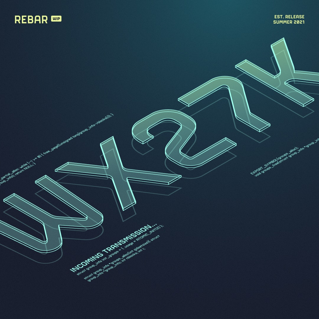
Initial tests using Rebar for the first time
During the spacing and kerning process I tested exports of Rebar a few times. Even though Glyphs has testing tools, I wanted to put Rebar through some design stress-testing. I used Illustrator and Figma to play around with it and see how it performed. This informed me about missed kerning pairs, line-height issues, and many other bugs that needed to be ironed out. I also started sharing examples on Instagram and Dribbble to get initial feedback. This part was incredibly thrilling as I was using my font for the first time.
In Glyphs you can use included strings of sample text to test out your font. It's definitely handy, but will only get you so far. I used those as my starting point for refining my kerning, but when I came across Hoefler & Co's “Text for Proofing Fonts” article I felt like I hit the jackpot. I copied and pasted their lowercase and uppercase proofs into Glyphs and went word by word to refine my kerning. While time-consuming this process identified a lot of kerning needs. I suggest just grabbing a beverage of choice and working through them one after the other.
With my first font released and the knowledge I've picked up along the way I'm anxious to get started on my next font. I have a couple of ideas brewing. My hands will be full with managing Rebar in the meantime so it'll be awhile before I kick off font number two, but I'm definitely hooked on the journey. If you pick up a copy of Rebar I'd love to know what you think. Feel free to email me or reach out to me on Twitter @philcoffman or @methodandcraft.